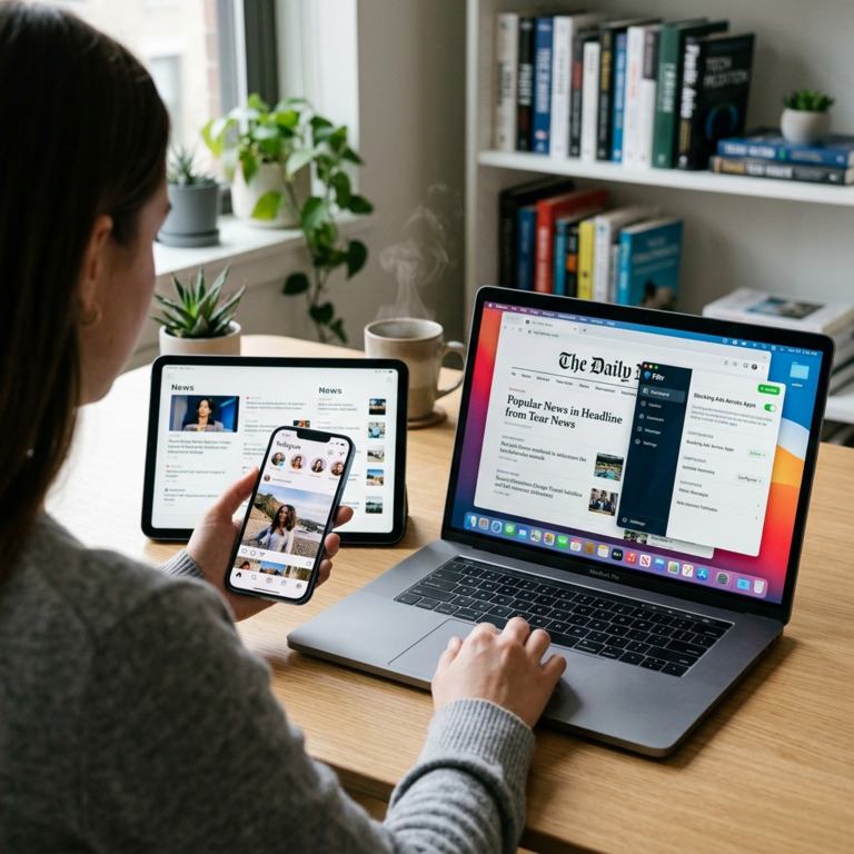
Apple’s popular music recognition app, Shazam, has received a stunning visual makeover on iOS, showcasing the tech giant’s Liquid Glass design language. This fresh update represents a broader trend in the tech industry towards visual redesigns aimed at improving user experience and accessibility. The sleek new look features a revamped toolbar and enhanced user interface, catering to the demand for intuitive and aesthetically pleasing design in technology apps.
As Apple continues to prioritize user-centric design, the Liquid Glass makeover for Shazam signifies a strategic move to align the app with the company’s overall visual language. By incorporating this modern design approach, Apple aims to create a seamless and visually appealing experience for users navigating the app. This shift towards a more cohesive design language across Apple’s ecosystem reinforces the brand’s commitment to delivering a consistent and premium user experience.
The adoption of Liquid Glass in the Shazam app not only enhances its aesthetics but also reflects a shift towards more visually engaging interfaces in the tech industry as a whole. With users increasingly valuing design and user experience, companies are investing in visual redesigns to make their products more appealing and user-friendly. This trend underscores the importance of creating visually striking and intuitive interfaces to attract and retain users in today’s competitive tech landscape.
The revamped toolbar and improved user interface in Shazam’s Liquid Glass makeover are designed to streamline the user experience, making it easier for consumers to access and interact with the app’s features. By prioritizing user-friendly design elements, Apple is catering to the evolving expectations of tech users who seek seamless and visually pleasing interfaces. This focus on enhancing usability and aesthetics sets a new standard for app design, encouraging other tech companies to prioritize user experience in their product development.
The visual redesign of Shazam for iOS not only elevates the app’s aesthetics but also highlights the significance of design in shaping user interactions with technology. As more companies embrace visual redesigns to enhance user experience, the tech industry is witnessing a shift towards more visually appealing and intuitive interfaces. This emphasis on design reflects a growing recognition of the impact that visual elements have on user engagement and satisfaction, emphasizing the importance of thoughtful and user-centric design in tech products.
Overall, Apple’s Liquid Glass makeover for Shazam on iOS exemplifies the company’s commitment to innovation and user experience. By incorporating a visually striking design language into the app, Apple is setting a new standard for app design in the tech industry. This trend towards visual redesigns underscores the evolving preferences of tech users for intuitive and aesthetically pleasing interfaces, driving companies to prioritize design and user experience in their product development efforts.